
Buttons Tab in the Design Section
The Buttons tab in the design section allows you to customize the default button styles across your LeadsWithDemos popups, forms, and landing pages. This ensures your buttons are visually appealing and consistent with your brand and user experience design.
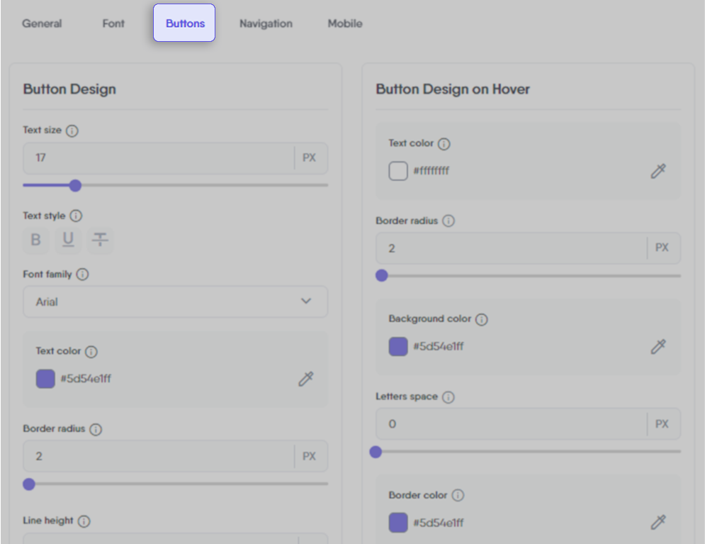
Button Design
Tailor the default design of buttons used across all user-facing elements, including popups, forms, and landing pages.
Text Size
Set the default text size within buttons.
Text Style
Choose the default style for button text, like bold, underlined or strikethrough text.
Line Height
Control the default line spacing in button text.
Font Family
Select the default font for button text.
Letter Space
Adjust the default letter spacing in button text.
Text Color
Choose the default text color for buttons.
Background Color
Set the default background color for buttons.
Border Width
Define the default width of button borders.
Border Color
Choose the default color for button borders.
Border Radius
Adjust the default curvature of button corners.
Button Design on Hover
Customize how the default buttons appear when hovered over with the mouse.
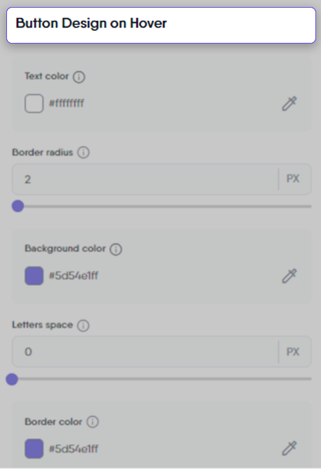
Text Color
Change the default text color in buttons upon hover.
Border Radius
Modify the default button corner curvature on hover.
Background Color
Alter the default background color of buttons on hover.
Letter Space
Adjust the default letter spacing in button text on hover.
Border Color
Change the border color of buttons on hover.